


Brand and packaging
For a new brand, we can work on the identity, product presentation and packaging alongside the store.
Design & UX
Bring the references and the changes you keep getting stuck on. We shape the design around your products, then build the shopping experience with the same attention to detail.

The work
It might be a product page that feels cluttered, a mobile layout that is difficult to use or a visual direction that never made it into the finished store. We review the actual screens, work through alternatives and implement the agreed design.
For a new brand, we can work on the identity, product presentation and packaging alongside the store.
We check product information, variant selection, navigation and checkout as parts of the same purchase.
Images, variants, availability and the final total, presented so customers can decide and order with confidence.
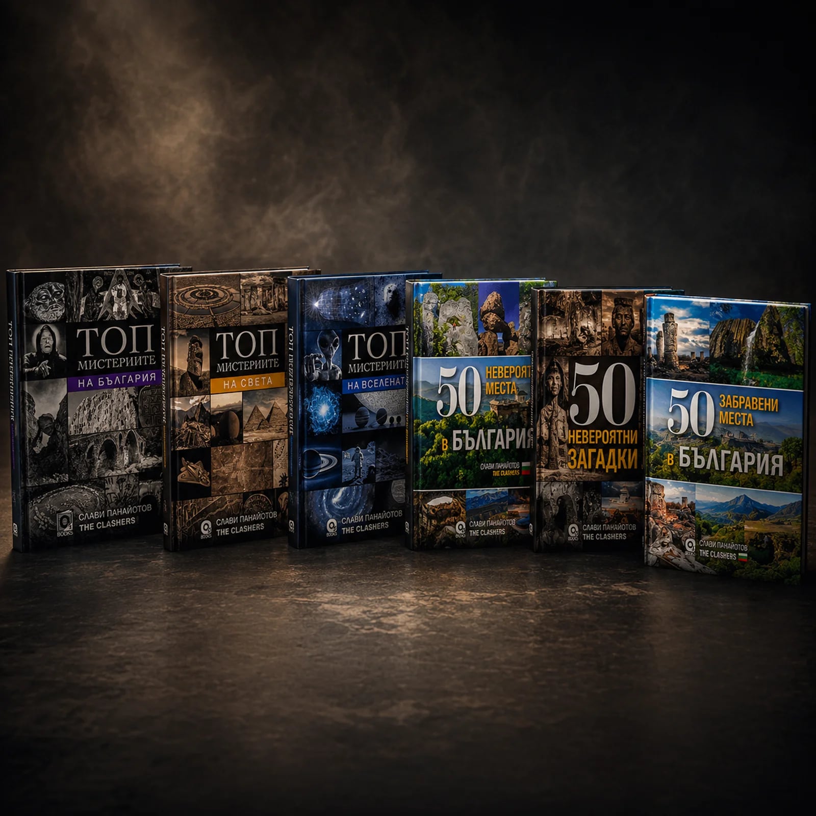
The Clashers
Books, 19 and ClashVit have their own character within The Clashers store. The design gives the product ranges room to be different while keeping them part of the same shopping experience.
Explore the projectBehind the screens
We review product discovery on mobile, information on the product page and the steps to checkout. The output is a design direction, key page layouts and an implementation scope, with decisions tied to the problems we find.
Working together
Walk us through your store and references. We identify the pages and interactions that matter most to customers.
We work through navigation, product pages and mobile layouts with your catalogue, so feedback goes beyond colours and mood boards.
The agreed design becomes a working store. We check spacing, content, product choices and checkout on different screen sizes.
Yes. Tell us what you like about it: the product presentation, spacing, navigation or a specific interaction. We use that to understand your direction and develop a design for your own brand.
With a review of your current store: product pages, mobile shopping, checkout and how your brand is presented. In the first conversation we show what we would improve and recommend the right implementation approach for your store and goals.
A better design can remove friction, but sales also depend on your products, traffic, prices and offer. We use available analytics and customer feedback to decide what to change, then review the result after launch.
Yes. INARA is an example of work spanning brand identity, product artwork, packaging and the store. We can also work within an established identity.
Send examples of the exact screen or action that feels wrong, alongside references you like. We turn these into key layouts and shopping scenarios: finding a product, choosing a variant and completing an order on mobile. We agree what will demonstrate that each problem is resolved.
Tell us what you want to improve or launch. You do not need a finished brief or a meeting booking. The first conversation is free and without obligation.
info@alphabite.io ↗